Luis Carli
About
Data Visualizations
2012.09.01
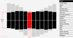
Wood Dimensional Changes
I partnered with researcher Rafael Passarelli to develop those first of its kind interactive visualization that shows how much wood changes its size in …
2013.10.01
Delivery Logistics in Syria
I was approached by a Lebanon company to visualize their data on delivery logistics in Syria. They wanted to know how the war in the country was affecting …
2017.12.03
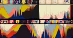
Color Quantization in Music Videos
What are the primary colors in a music clip, and how do those colors change over time? To answer that question I extracted and visualized colors from music …
2014.07.01
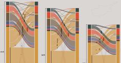
Phone Contacts in Portugal
I worked on this project during my time on the MIT Senseable City Lab. The objective of the project was to see if there was a relation between the number …
2013.05.01
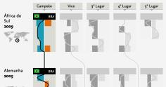
Confederations Cup
The Brazilian newspaper Folha de São Paulo approached me to do a visualization about the Confederations Cup. I decided the most exciting thing was to try …
2017.10.01
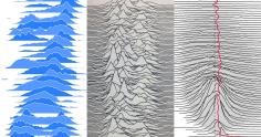
How to Joyplot
A visual display of the logic behind _Joyplots_. How they are made and what they are good for.
2012.05.09
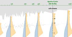
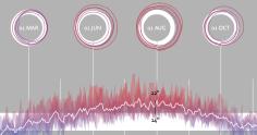
Weather Over the Year
Weather data is mostly seem in the scales of a few days. Because of that I wanted to visualize the weather pattern across multiple years in several cities …
2013.11.01
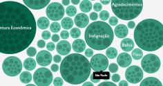
Deputies Speechs in Brazil
Together Davi Moreira and Manoel Galdino I visualized for the Brazilian Government 14k speeches done by their Federal Deputy Legislators.
2017.12.13
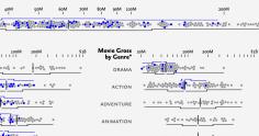
Movies Box Office
What information can be seen when we organize movies by their gross revenue, their studio, genre, and open date?