How to Joyplot
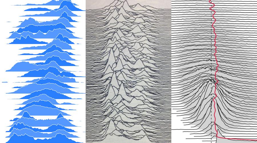
Those charts have been called “Stacked Distributions” (even if not literally stacked), “Frequency Trails”, “Joyplots” (in reference to the joy division album Unknown Pleasures) “Ridgeline Plots”, among others. Different names, but they all share the same overall structure: multiple distributions charts that partially overlap each other.
They are specially interesting because of how they trade plot overlaping with visual information density, while still maintaining legibility. Still, the logic of how they are put together is not always clear for the readers, but we can address this with some nice animations!
First, lets start with the data for our examples: we’re going to use the trips from the Boston bike sharing, more specifically the start time and month of those trips. In 2016 there were more than 1.2 million journeys, here’s a brief example of that data.
We now want to know when during the day there are more bike trips, we want to see how the trips are distributed during the day, when they are more and less frequent. For doing that we will count how many trips started in each 15 min interval of a day cycle. On the looping animation bellow you can see this counting, and the frequency of trips formed by it.
By looking at the distribution of bike trips along the day, we can see that four in the morning is the lowest point of the day and that the afternoon has more trips than the morning. Probably more people decide to ride back home than to ride from home.
Next step is to slice this chart in multiple ones, so that instead of just one frequency plot we will have multiple. Each dataset provides unique ways to group and divide the data, for this one we will use the month in which the trip took place, lets slice our chart so that we have a frequency for each month.
There we have it, our Frequency Trail plot! Because of how we sliced the data we can see that there's many more trips on summer months than on winter months, which is to be expected.
Apart from how the data can be grouped or sliced, two other things highly influence how a Frequency Trail will look like: how far each distribution is placed from one another and how hight their highest point may go.
On the next chart you can play with those two variables and try to find the combination that better communicate the data.
Taller distributions better communicate the difference between each of their data points, but also can create bigger overlaps; the overlaps can be countered by separating the distributions from one another, but we have a limited chart height and separating the plots too much will not allow us to show everything; we can make the distributions less taller so that they fit on the chart, but then it will be harder to read their data; and so on...
The data for this article and more can be found at the Hubway System Data site.