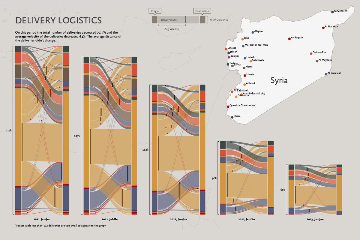
Delivery Logistics in Syria
In 2013, I was approached by a Lebanon company to visualize their data on delivery logistics in Syria. They wanted to know how the war in the country was affecting its deliveries. Here’s one of the results of that project.
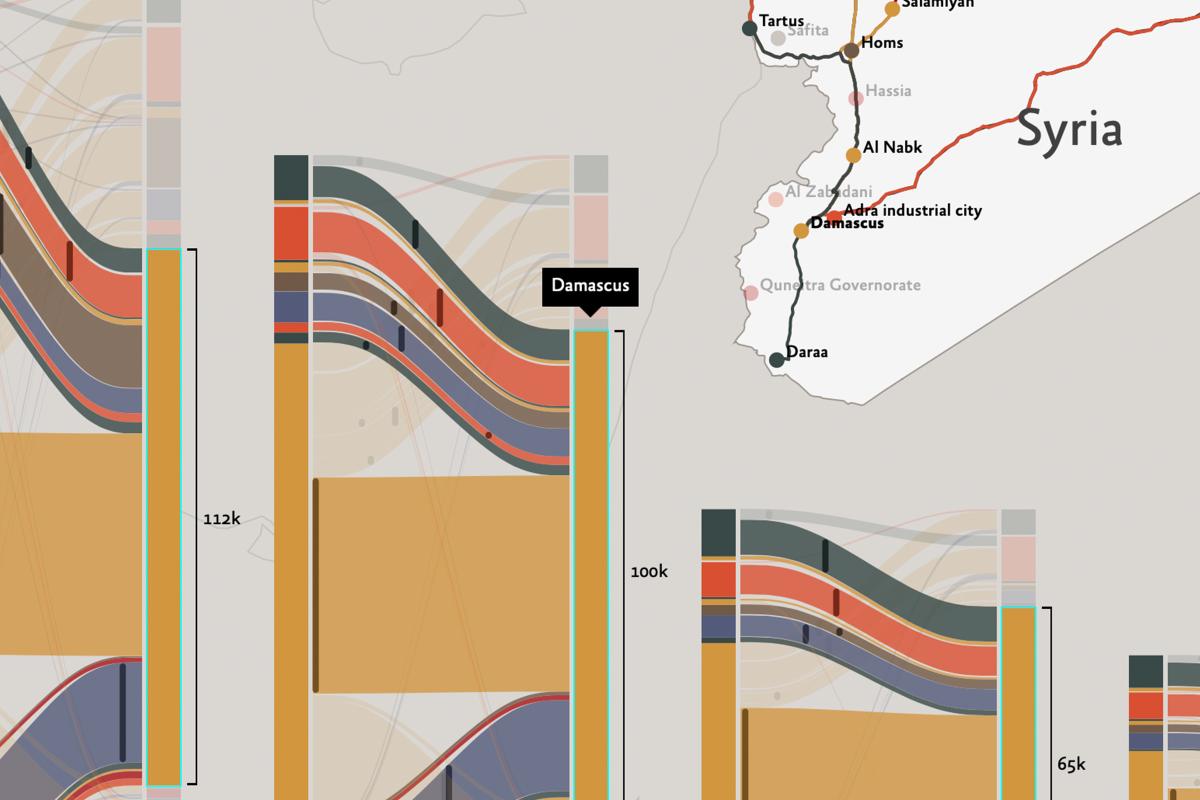
Each one of the columns contains six months of data. The y axis represents the number of deliveries, the higher it’s there were more deliveries in that period. The color groups on the left of a column represent the origin city of a shipment, the color groups on the right the destination. The lines connecting those groups are delivery routes. The bigger each color group, the more deliveries from or to a city, or on a specific path.
Hover the mouse to get more information, and to see the routes drawn on the map.
To see the interactive version, open the site in a bigger window